Usability Study: Amazon Comparison Chart
E-Commerce
Exploring customers' experiences with comparison chart in shopping for Amazon devices.

Impact
We surfaced 6 prioritized usability issues and presented findings and actionable recommendations to Amazon researchers, PMs, and designers. Key impact:
Guided redesign direction: This study surfaced discoverability, scannability, and information overload as the top barriers, and delivered a severity-rated roadmap to help the team prioritize fixes across desktop and mobile.
Shaped the research roadmap: We mapped out what was already known vs what needed further investigation, helping the team understand where to invest next.
Informed product strategy: It uncovered a link between shopping stage and chart engagement, suggesting the need to tailor chart experiences for early vs late stage shoppers.
Skills
Usability Study, Competitive Analysis, Mixed-Methods, Stakeholder Engagement, B2C
Role
Lead UXR
Team
Amazon Devices team & UW HCDE
Timeline
January - March 2024
When shoppers can't find or understand a comparison chart, it'd be challenging to make confident purchase decisions.
I led a remote moderated usability study comparing Amazon's chart against competitors' charts (e.g. Apple, Samsung, Best Buy, and Blink). Findings gave the team a prioritized, evidence-backed roadmap for improving discoverability, scannability, and mobile experience.
* Sponsored by Amazon, this usability study was completed in a team of 4 as part of the graduate-level Usability Studies course at the University of Washington.
Impact
We surfaced 6 prioritized usability issues and presented findings and actionable recommendations to Amazon researchers, PMs, and designers. Key impact:
Guided redesign direction: This study surfaced discoverability, scannability, and information overload as the top barriers, and delivered a severity-rated roadmap to help the team prioritize fixes across desktop and mobile.
Shaped the research roadmap: We mapped out what was already known vs what needed further investigation, helping the team understand where to invest next.
Informed product strategy: It uncovered a link between shopping stage and chart engagement, suggesting the need to tailor chart experiences for early vs late stage shoppers.
Details
Context
When shopping online, comparison is a critical step before making a purchase decision. Comparison charts exist to help customers evaluate options quickly and confidently.
In 2023, Amazon launched an updated comparison chart for its Fire Tablet product page. But it was unclear whether the chart was actually helping customers compare and decide — or creating more friction than it resolved.
This raised a clear question: what aspects of Amazon's comparison chart help or hinder the customer experience, and what can Amazon learn from competitors to improve it?
Working with the Amazon Device Team, we conducted a usability study evaluating Amazon's Fire Tablet chart against Apple, Samsung, Best Buy, and Blink — across both desktop and mobile — to deliver actionable redesign recommendations and a prioritized research roadmap.
Methods
01 Recruitment
Participants were recruited through UserTesting. We could only recruited a small sample size due to time constraints, so we recruited participants that represented the target audiences of comparison charts. After careful consideration, we decided on the following criteria:

Users aged 18-50

NOT working in tech, research, or journalism

Interested in buying Tablets in the past 6 months or future
02 Participants Profile
We recruited 12 participants based in North America, encompassing:
6 Desktop and 6 Mobile users
6 Amazon device owners and 6 non-owners
4 Early-stage shoppers, 4 middle-stage shoppers, 4 late-stage shoppers

03 Tasks
The testing method was a Remote Moderated usability study via Usertesting.com. The study consisted of a Think Aloud Session (30-40 min), where participants navigated
Amazon fire tablet chart
1-2 third party charts
Blink subscription chart
The order of Amazon chart and third party chart was randomized for each participant to reduce order bias and the risk of priming. These tasks were followed by a post-task interview (10-15 min) and Likert scale rating questions.

04 Data Collection

05 Data Analysis
How did we find the story behind complicated data? Through collaborative data analysis, we transformed the chaos into a clear picture of user experience with Amazon’s comparison chart.

Qualitative
Qualitative
Data on Where do users click, Why did users leave the page, When and Where do they go after leaving the pages, and their think-aloud thought process were recorded.
We then conducted affinity mapping and thematic analysis to identify patterns and trends in qualitative data.
Quantitative
Quantitative
Likert scale ratings for each comparison charts were represented in dot graphs to compare distributions across participants’ ratings.

06 Severity Scope
To categorize and help the Amazon team prioritize issues to fix, we implemented the Nielsen Norman severity rating scale to assign severity level based on criteria below. With this scale, the severity ratings of usability issues are decided on Frequency, Impact, and Persistence.
0 = I don't agree that this is a usability problem at all
1 = Cosmetic problem only: need not be fixed unless extra time is available on project
2 = Minor usability problem: fixing this should be given low priority
3 = Major usability problem: important to fix, so should be given high priority
4 = Usability catastrophe: imperative to fix this before product can be released
Findings & Recommendations
Top Findings
Discoverability: Half of the participants didn’t find the chart in their shopping journey, indicating a need for improved discoverability via higher placement and “click-through” features.
Visual Scanability: The fire tablet chart includes helpful information, but too much text and scrolling create barriers in visual scanability.
Information Quality: The fire tablet chart effectively delivers relevant and clear, and sufficient information, but users preferred metrics in real-world context that they could easily understand, over technical terms
Finding 01 - Compared with competitors, Amazon Fire Tablet chart suffers from low discoverability due to chart placement far down the page
Amazon Fire Tablet
50% of desktop and mobile users found the Amazon Fire tablet comparison chart on their own. The remaining participants were not looking for the chart until being prompted to compare across different models.

Third Party Chart: Blink Chart, Samsung, Best Buy
Initial observation revealed a disparity in engagement with the comparison charts. Participants interacted less frequently with the Amazon Fire tablet chart compared to competitors. To understand this behavior, we delved deeper through follow-up interviews, identifying factors that impacted the discoverability of Amazon's chart.


Why it matters?
3 out of 6 desktop users and 2 out of 6 mobile users mentioned that the comparison chart was too hard to find since it’s located far down the page.
This was especially problematic on mobile devices, where smaller screens made the hunt even tougher.

P4
Desktop user, owner of Amazon device, late in shopping journey
“The chart was very useful. I would just say the placement of it. Being all the way down at the bottom wasn't as helpful, just because you have to scroll through all parts of it.”
“The chart was very useful. I would just say the placement of it. Being all the way down at the bottom wasn't as helpful, just because you have to scroll through all parts of it.” (P4, Desktop user, owner of Amazon device, late in shopping journey)


P7
Mobile user, non-owner of Amazon device, early in shopping journey
“The Amazon chart took forever to find, which is crazy. Because it's under the ocean like 3,000 feet down, like there's no way I'm ever getting down there, especially on a phone.”
“The Amazon chart took forever to find, which is crazy. Because it's under the ocean like 3,000 feet down, like there's no way I'm ever getting down there, especially on a phone.” (P7, Mobile user, non-owner of Amazon device, early in shopping journey)
Discussion & Recommendation - Finding 01
Severity: desktop = 2; mobile = 3.
More testing is needed to determine the ideal placement and design of comparison charts to improve discoverability and enhance users’ engagement. We may consider A/B testing to see
If users engage more with higher or lower placement on the page.
If adding a link higher up on the page that directs participants to the chart will enhance user engagement with the chart.
Finding 02 - All early-stage users used the “see the difference” within Pick-A-Version to make their final shopping decisions.
3 out of 6 Desktop users and 2 out of 6 Mobile users interacted with the “see the difference” link within Pick-A-Version.
Of those who interacted with it, 4 users (2 Desktop and 2 Mobile) relied solely on this feature to make a final buying decision before seeing the actual comparison chart lower down the page.

Why it matters?
All participants who opted for the “see the difference” feature instead of the detailed comparison chart [Pilot 2, P5, P6, P7] were all of our early-stage participants. This observation revealed a potential link between shopping stage and chart preference: early-stage shoppers interacted less with the comparison chart, and they tended to use a quick overview (“see the difference”) that highlighted key differences to narrow down their initial choices.

P5
Desktop user, owner of Amazon device, early in shopping journey
“I have seen the comparison chart on Amazon. It just didn't occur to me right away, because I saw the “see the differences”. And to me I thought that was replacing the chart in my mind.”
“I have seen the comparison chart on Amazon. It just didn't occur to me right away, because I saw the “see the differences”. And to me I thought that was replacing the chart in my mind.” (P5, desktop user, owner of Amazon device, early in shopping journey)

P6
Mobile user, owner of Amazon device, early in shopping journey
“This one felt more cumbersome to navigate than the short one at the very top.”
“This one felt more cumbersome to navigate than the short one at the very top.” (P6, Mobile user, owner of Amazon device, early in shopping journey)
Discussion & Recommendation - Finding 02
Severity: desktop & mobile =1
Further research is still needed to better understand the link between shopping stage and user behaviors. What are the differences in information needs for early-, mid-, and late-stage shoppers? Does the pick-a-version widget and the comparison chart perform a similar function? Understanding of such a correlation might boost engagement with the comparison chart and inform future redesign that would better cater to the different needs of diverse customers.
Finding 03 - Users prefer scannable charts to easily find differences across products.
5 out of 6 Mobile users expressed a need to find specific differences in the charts, compared to 2 out of 6 Desktop users.
Mobile users struggled more with navigating the charts due to the excessive information on smaller screens, making it hard to see differences.

Pilot 2
Desktop user, non-owner of Amazon device, early in shopping journey
“It’s text-heavy. It does give you lots of info but it can be confusing sometimes. There are too many things to look at when using the chart.”
“It’s text-heavy. It does give you lots of info but it can be confusing sometimes. There are too many things to look at when using the chart.” (Pilot 2, Desktop user, non-owner of Amazon device, early in shopping journey)

P9
Mobile user, owner of Amazon device, early in shopping journey
“I hope differences are highlighted in the chart: most things seem to be similar. When I use a chart, the most important thing is to look for differences, but with the current chart you have to read everything..”
“I hope differences are highlighted in the chart: most things seem to be similar. When I use a chart, the most important thing is to look for differences, but with the current chart you have to read everything..” (P9, Mobile user, owner of Amazon device, early in shopping journey)
What we can learn from competitors’ chart?
Apple: 4 out of 5 participants mentioned that the icons, big font, lots of white space and less text makes it visually appealing and easy to read.
Blink: 10 out of 12 participants liked how the visual elements of checkmarks, dashes, and less text made the chart easy to read.

P1
Mobile user, owner of Amazon device, late in shopping journey]
“Because my eyes were looking for differences, the green checkmarks [in Blink chart] make it very easy”
“Because my eyes were looking for differences, the green checkmarks [in Blink chart] make it very easy” (P1, Mobile user, owner of Amazon device, late in shopping journey)

Discussion & Recommendation - Finding 03
Severity: desktop =2; mobile = 3
People liked visual cues in the chart to quickly highlight differences.
It's recommended to use visual cues and include less columns in the chart to highlight differences
Further testing is needed to confirm the optimal number of models and metrics to compare in the chart.
Finding 04 - Users prefer real-world implications of labels over technical terms.
3 Desktop and 2 Mobile participants mentioned the importance of information presented in a real-world context, favoring descriptions like "up to 10 hours of battery life" instead of "1000mAh."
P1
Desktop user, non-owner of Amazon device, late in shopping journey
"The thing that's annoying about the CPU was it doesn't really help me understand, like the Gigahertz, in terms of how fast any of these are until you get up to the fire.
"The thing that's annoying about the CPU was it doesn't really help me understand, like the Gigahertz, in terms of how fast any of these are until you get up to the fire. (P1, Desktop user, non-owner of Amazon device, late in shopping journey)
Discussion & Recommendation - Finding 04
Severity: desktop & mobile = 2
Provide real-world performance tests rather than just GHz, such as everyday tasks like web browsing and gaming.
Improve information clarity through:
Displaying information in a clear, easy-to-understand, friendly way.
Providing users with an intuitive way to access additional information through info icons, similar to those used in the Amazon Blink chart that received positive feedback.
Reflections
Thinking Back
Our insights not only helped inform future redesign of Amazon device chart, but would also enhance the priority and visibility of Amazon’s device comparison chart to aid decision making in product development.
If we were to do this study again, we would further narrow down the scope of our study. With so many elements at play – desktops, mobiles, third-party charts, and subscription charts – we skimmed the surface on some aspects. Next time, we'll zoom in on a specific area, telling a deeper story behind the comparison chart.
Thinking Forward
The journey with comparison chart is not over. There’re also many interesting directions to pursue in the future:
Information Hierarchy: Test different layouts and information presented to see which ones lead to better user comprehension. Eye-tracking and heatmap analysis could be useful here
Longitudinal Study: Track user behavior over time to understand how their needs and preferences for comparison charts evolve throughout the shopping journey.
International Expansion: Conduct user research in different countries to understand cultural nuances in information preferences and interaction with comparison chart.
By delving deeper and potential expanding the scope in future research, we hope to open a new chapter of Amazon’s comparison chart, empowering users to confidently navigate across devices and driving Amazon’s business goals.


Usability Study: Amazon Comparison Chart
E-Commerce
Exploring customers' experiences with comparison chart in shopping for Amazon devices.
Tags
Usability Study, Competitive Analysis, Mixed-Methods, Stakeholder Engagement, B2C
Role
Lead UXR
Team
Amazon Devices team & UW HCDE
Timeline
January - March 2024
When shoppers can't find or understand a comparison chart, it'd be challenging to make confident purchase decisions.
I led a remote moderated usability study comparing Amazon's chart against competitors' charts (e.g. Apple, Samsung, Best Buy, and Blink). Findings gave the team a prioritized, evidence-backed roadmap for improving discoverability, scannability, and mobile experience.
* Sponsored by Amazon, this usability study was completed in a team of 4 as part of the graduate-level Usability Studies course at the University of Washington.
Impact
We surfaced 6 prioritized usability issues and presented findings and actionable recommendations to Amazon researchers, PMs, and designers. Key impact:
Guided redesign direction: This study surfaced discoverability, scannability, and information overload as the top barriers, and delivered a severity-rated roadmap to help the team prioritize fixes across desktop and mobile.
Shaped the research roadmap: We mapped out what was already known vs what needed further investigation, helping the team understand where to invest next.
Informed product strategy: It uncovered a link between shopping stage and chart engagement, suggesting the need to tailor chart experiences for early vs late stage shoppers.
Details
Context
When shopping online, comparison is a critical step before making a purchase decision. Comparison charts exist to help customers evaluate options quickly and confidently.
In 2023, Amazon launched an updated comparison chart for its Fire Tablet product page. But it was unclear whether the chart was actually helping customers compare and decide — or creating more friction than it resolved.
This raised a clear question: what aspects of Amazon's comparison chart help or hinder the customer experience, and what can Amazon learn from competitors to improve it?
Working with the Amazon Device Team, we conducted a usability study evaluating Amazon's Fire Tablet chart against Apple, Samsung, Best Buy, and Blink — across both desktop and mobile — to deliver actionable redesign recommendations and a prioritized research roadmap.
Methods
01 Recruitment
Participants were recruited through UserTesting. We could only recruited a small sample size due to time constraints, so we recruited participants that represented the target audiences of comparison charts. After careful consideration, we decided on the following criteria:
Users aged 18-50
NOT working in tech, research, or journalism
Interested in buying Tablets in the past 6 months or future
02 Participants Profile
We recruited 12 participants based in North America, encompassing:
6 Desktop and 6 Mobile users
6 Amazon device owners and 6 non-owners
4 Early-stage shoppers, 4 middle-stage shoppers, 4 late-stage shoppers
03 Tasks
The testing method was a Remote Moderated usability study via Usertesting.com. The study consisted of a Think Aloud Session (30-40 min), where participants navigated
Amazon fire tablet chart
1-2 third party charts
Blink subscription chart
The order of Amazon chart and third party chart was randomized for each participant to reduce order bias and the risk of priming. These tasks were followed by a post-task interview (10-15 min) and Likert scale rating questions.
04 Data Collection
05 Data Analysis
How did we find the story behind complicated data? Through collaborative data analysis, we transformed the chaos into a clear picture of user experience with Amazon’s comparison chart.
Qualitative
Data on Where do users click, Why did users leave the page, When and Where do they go after leaving the pages, and their think-aloud thought process were recorded.
We then conducted affinity mapping and thematic analysis to identify patterns and trends in qualitative data.
Quantitative
Likert scale ratings for each comparison charts were represented in dot graphs to compare distributions across participants’ ratings.
06 Severity Scope
To categorize and help the Amazon team prioritize issues to fix, we implemented the Nielsen Norman severity rating scale to assign severity level based on criteria below. With this scale, the severity ratings of usability issues are decided on Frequency, Impact, and Persistence.
0 = I don't agree that this is a usability problem at all
1 = Cosmetic problem only: need not be fixed unless extra time is available on project
2 = Minor usability problem: fixing this should be given low priority
3 = Major usability problem: important to fix, so should be given high priority
4 = Usability catastrophe: imperative to fix this before product can be released
Findings & Recommendations
Top Findings
Discoverability: Half of the participants didn’t find the chart in their shopping journey, indicating a need for improved discoverability via higher placement and “click-through” features.
Visual Scanability: The fire tablet chart includes helpful information, but too much text and scrolling create barriers in visual scanability.
Information Quality: The fire tablet chart effectively delivers relevant and clear, and sufficient information, but users preferred metrics in real-world context that they could easily understand, over technical terms
Finding 01 - Compared with competitors, Amazon Fire Tablet chart suffers from low discoverability due to chart placement far down the page
Amazon Fire Tablet
50% of desktop and mobile users found the Amazon Fire tablet comparison chart on their own. The remaining participants were not looking for the chart until being prompted to compare across different models.
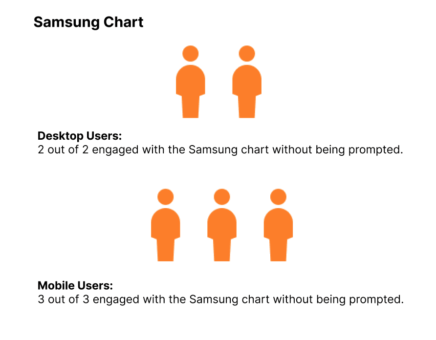
Third Party Chart: Blink Chart, Samsung, Best Buy
Initial observation revealed a disparity in engagement with the comparison charts. Participants interacted less frequently with the Amazon Fire tablet chart compared to competitors. To understand this behavior, we delved deeper through follow-up interviews, identifying factors that impacted the discoverability of Amazon's chart.
Why it matters?
3 out of 6 desktop users and 2 out of 6 mobile users mentioned that the comparison chart was too hard to find since it’s located far down the page.
This was especially problematic on mobile devices, where smaller screens made the hunt even tougher.
“The chart was very useful. I would just say the placement of it. Being all the way down at the bottom wasn't as helpful, just because you have to scroll through all parts of it.” (P4, Desktop user, owner of Amazon device, late in shopping journey)
“The Amazon chart took forever to find, which is crazy. Because it's under the ocean like 3,000 feet down, like there's no way I'm ever getting down there, especially on a phone.” (P7, Mobile user, non-owner of Amazon device, early in shopping journey)
Discussion & Recommendation - Finding 01
Severity: desktop = 2; mobile = 3.
More testing is needed to determine the ideal placement and design of comparison charts to improve discoverability and enhance users’ engagement. We may consider A/B testing to see
If users engage more with higher or lower placement on the page.
If adding a link higher up on the page that directs participants to the chart will enhance user engagement with the chart.
Finding 02 - All early-stage users used the “see the difference” within Pick-A-Version to make their final shopping decisions.
3 out of 6 Desktop users and 2 out of 6 Mobile users interacted with the “see the difference” link within Pick-A-Version.
Of those who interacted with it, 4 users (2 Desktop and 2 Mobile) relied solely on this feature to make a final buying decision before seeing the actual comparison chart lower down the page.
Why it matters?
All participants who opted for the “see the difference” feature instead of the detailed comparison chart [Pilot 2, P5, P6, P7] were all of our early-stage participants. This observation revealed a potential link between shopping stage and chart preference: early-stage shoppers interacted less with the comparison chart, and they tended to use a quick overview (“see the difference”) that highlighted key differences to narrow down their initial choices.
“I have seen the comparison chart on Amazon. It just didn't occur to me right away, because I saw the “see the differences”. And to me I thought that was replacing the chart in my mind.” (P5, desktop user, owner of Amazon device, early in shopping journey)
“This one felt more cumbersome to navigate than the short one at the very top.” (P6, Mobile user, owner of Amazon device, early in shopping journey)
Discussion & Recommendation - Finding 02
Severity: desktop & mobile =1
Further research is still needed to better understand the link between shopping stage and user behaviors. What are the differences in information needs for early-, mid-, and late-stage shoppers? Does the pick-a-version widget and the comparison chart perform a similar function? Understanding of such a correlation might boost engagement with the comparison chart and inform future redesign that would better cater to the different needs of diverse customers.
Finding 03 - Users prefer scannable charts to easily find differences across products.
5 out of 6 Mobile users expressed a need to find specific differences in the charts, compared to 2 out of 6 Desktop users.
Mobile users struggled more with navigating the charts due to the excessive information on smaller screens, making it hard to see differences.
“It’s text-heavy. It does give you lots of info but it can be confusing sometimes. There are too many things to look at when using the chart.” (Pilot 2, Desktop user, non-owner of Amazon device, early in shopping journey)
“I hope differences are highlighted in the chart: most things seem to be similar. When I use a chart, the most important thing is to look for differences, but with the current chart you have to read everything..” (P9, Mobile user, owner of Amazon device, early in shopping journey)
What we can learn from competitors’ chart?
Apple: 4 out of 5 participants mentioned that the icons, big font, lots of white space and less text makes it visually appealing and easy to read.
Blink: 10 out of 12 participants liked how the visual elements of checkmarks, dashes, and less text made the chart easy to read.
“Because my eyes were looking for differences, the green checkmarks [in Blink chart] make it very easy” (P1, Mobile user, owner of Amazon device, late in shopping journey)
Discussion & Recommendation - Finding 03
Severity: desktop =2; mobile = 3
People liked visual cues in the chart to quickly highlight differences.
It's recommended to use visual cues and include less columns in the chart to highlight differences
Further testing is needed to confirm the optimal number of models and metrics to compare in the chart.
Finding 04 - Users prefer real-world implications of labels over technical terms.
3 Desktop and 2 Mobile participants mentioned the importance of information presented in a real-world context, favoring descriptions like "up to 10 hours of battery life" instead of "1000mAh."
"The thing that's annoying about the CPU was it doesn't really help me understand, like the Gigahertz, in terms of how fast any of these are until you get up to the fire. (P1, Desktop user, non-owner of Amazon device, late in shopping journey)
Discussion & Recommendation - Finding 04
Severity: desktop & mobile = 2
Provide real-world performance tests rather than just GHz, such as everyday tasks like web browsing and gaming.
Improve information clarity through:
Displaying information in a clear, easy-to-understand, friendly way.
Providing users with an intuitive way to access additional information through info icons, similar to those used in the Amazon Blink chart that received positive feedback.
Reflections
Thinking Back
Our insights not only helped inform future redesign of Amazon device chart, but would also enhance the priority and visibility of Amazon’s device comparison chart to aid decision making in product development.
If we were to do this study again, we would further narrow down the scope of our study. With so many elements at play – desktops, mobiles, third-party charts, and subscription charts – we skimmed the surface on some aspects. Next time, we'll zoom in on a specific area, telling a deeper story behind the comparison chart.
Thinking Forward
The journey with comparison chart is not over. There’re also many interesting directions to pursue in the future:
Information Hierarchy: Test different layouts and information presented to see which ones lead to better user comprehension. Eye-tracking and heatmap analysis could be useful here
Longitudinal Study: Track user behavior over time to understand how their needs and preferences for comparison charts evolve throughout the shopping journey.
International Expansion: Conduct user research in different countries to understand cultural nuances in information preferences and interaction with comparison chart.
By delving deeper and potential expanding the scope in future research, we hope to open a new chapter of Amazon’s comparison chart, empowering users to confidently navigate across devices and driving Amazon’s business goals.